
How Lighting Affects Color Perception in Interior Design: The 2026 Luxury Guide
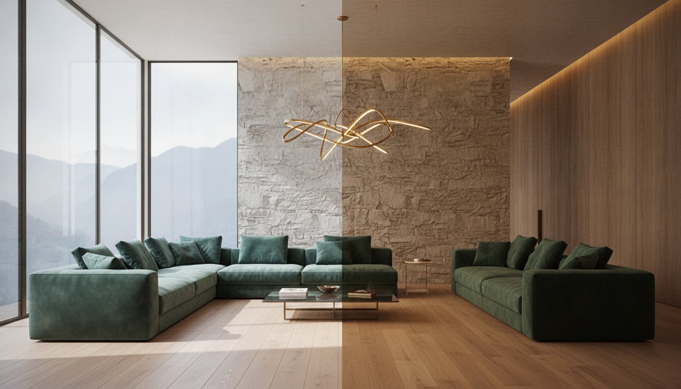
You meticulously selected a bespoke velvet in a deep emerald, yet under the evening glow of your chandelier, it suddenly appears as a flat, uninspired forest green. It's a disheartening moment many discerning homeowners face; the realization that a significant investment in high-end materials can be undermined by a single poorly chosen bulb. Understanding how lighting affects color perception in interior design is the invisible brush that determines whether a space feels like a cohesive masterpiece or a collection of mismatched elements.
It's natural to feel frustrated when a palette that looked perfect in the showroom feels "off" within your own sanctuary. You deserve a home where every texture and pigment remains true to your vision. This 2026 guide reveals the invisible science of illumination, showing you how to master the interplay between light and pigment to create flawless, high-end residential spaces. We'll explore how to achieve color consistency across all times of day, decode technical standards like CRI and Kelvin, and provide the clarity needed to select palettes for every room orientation with absolute confidence.
Key Takeaways
- Understand the phenomenon of metamerism to prevent bespoke materials from shifting hues unexpectedly when moving from the showroom to your residence.
- Learn how to modulate natural light through directional exposure and window treatments to maintain a vibrant, "living" palette throughout the day.
- Master how lighting affects color perception in interior design by navigating the technical evolution of LED systems and high-CRI standards for absolute color integrity.
- Discover how to predict the interaction between light and luxury textures, ensuring that finishes like silk, stone, and plaster retain their intended depth and specularity.
- Explore a holistic design approach that integrates lighting at the conceptual phase, utilizing 3D visualizations to guarantee a harmonious interplay of pigment and illumination.
The Physics of Hue: Understanding Metamerism and Light Temperature
The success of a luxury interior often rests on a variable that remains invisible until it fails: the interaction between light wavelengths and physical pigments. At the heart of this challenge lies metamerism. This phenomenon occurs when two material samples appear to match perfectly under one light source but diverge sharply when moved to another. It’s the reason why a silk wallcovering might harmonize with a wool rug in a designer's studio, only to clash once installed in a residential suite. Understanding how lighting affects color perception in interior design requires looking beyond the surface of the paint to the spectral power distribution of the light itself. Every light source "activates" different pigments; if a bulb lacks the specific wavelengths that a material needs to reflect, the color will appear dull, distorted, or entirely different from its intended hue.
In high-end design hubs like San Francisco, luxury showrooms often employ specialized gallery-grade lighting designed to make colors pop with unnatural vibrancy. When these materials transition to a residential setting, the shift can be jarring. This isn't merely a technical hiccup; it has a profound psychological impact. A room intended to feel like a warm, inviting sanctuary can suddenly feel cold and clinical if the lighting fails to support the chosen palette. The soul of the space is fundamentally tied to this delicate balance. If the colors shift away from the intended design, the emotional resonance of the entire home shifts with them.
The Kelvin Scale: From Candlelight to Daylight
The warmth or coolness of a light source is measured by its Color Temperature, expressed in Kelvin (K). In the world of premium interiors, the range typically spans from the amber glow of 2700K to the crisp, blue-toned 5000K of noon daylight. Warm light naturally amplifies reds and yellows, creating an intimate atmosphere, but it can "muddy" cooler blues and greens. While 2700K is often favored for bedrooms to evoke a sense of rest, many professionals now consider 3000K to 3500K the "sweet spot" for high-end homes. This range provides enough clarity to keep neutrals crisp and whites clean without sacrificing the welcoming warmth that defines a luxury residence.
Color Rendering Index (CRI) and Luxury Finishes
While temperature dictates mood, the Color Rendering Index (CRI) dictates truth. For any space featuring expensive Italian fabrics or bespoke cabinetry, a CRI rating of 90 or higher is non-negotiable. Low CRI bulbs often lack the spectral depth to render subtle nuances, making rich textures look desaturated or "dead." Professionals also look closely at the R9 value, which specifically measures the rendering of saturated red tones. A high R9 value is essential for bringing out the natural warmth in fine wood grains and ensuring that skin tones appear healthy and natural within the space. Without these technical safeguards, even the most exquisite materials will fail to reach their full aesthetic potential.
The Dance of Natural Light: Directional Exposure and Color Vibrancy
Sunlight is the ultimate sculptor of interior spaces. It breathes life into pigments, yet its transient nature means a room's character shifts with the sun’s arc across the sky. Mastering how lighting affects color perception in interior design requires a deep understanding of this celestial rhythm. A designer's role is to choreograph this dance, ensuring that a curated palette remains resonant from the first light of dawn to the soft descent of twilight. When we treat natural light as a living element, we can use it to highlight architectural details and define the very soul of a home.
The intensity of this light isn't universal. Geographic location dictates the "flavor" of the sun. In the bright Miami coast, the light carries a blue-tinted reflection from the Atlantic, which perfectly complements cool-toned modernism and crisp whites. Contrast this with the high-altitude sun of Park City or the Utah mountains. Here, the light is exceptionally crisp and high-contrast, often requiring a delicate touch to ensure interiors feel cozy rather than exposed. In San Francisco, we often design for the "Golden Hour," selecting finishes that maximize that specific amber glow to create a sense of profound warmth within the home.
North vs. South-Facing Rooms: A Palette Strategy
The compass orientation of a room determines its baseline mood. North-facing light is consistently cool and bluish. Without professional intervention, these spaces can feel chilly; they require palettes with warmer undertones to maintain a sense of balance. Conversely, south-facing rooms are bathed in intense, warm light for much of the day. This abundance can wash out subtle, pale colors, but it makes bold, saturated hues sing with incredible depth. Managing east and west exposures requires even more precision, as one must balance the dramatic shifts between the soft morning glow and the long, amber shadows of late afternoon.
Modulation and Preservation
Architectural beauty shouldn't come at the cost of longevity. Strategic window treatments are essential for modulating color intensity and protecting bespoke furniture from UV degradation. By employing advanced lighting design techniques, we can filter harsh rays while maintaining the room's visual connection to the outdoors. This balance ensures that your materials remain as vibrant as the day they were installed. If you're looking to harmonize your home's natural exposure with a sophisticated palette, the experts at Pianta Design can help you navigate these complex environmental factors.
Every window is a lens, and every room is a canvas. By understanding the specific light quality of your region and the orientation of your architecture, you can transform a simple living space into a dynamic environment that evolves beautifully throughout the day. It’s about more than just visibility; it’s about the emotional resonance of color under the sun’s ever-changing touch.
Artificial Illumination: Navigating LEDs, Halogens, and Smart Systems
As the sun sets, the responsibility of defining a home's palette shifts from the sky to the ceiling. Artificial light isn't merely a substitute for the sun; it's a precise tool that can either elevate or erase the nuances of a design. Modern LED technology has finally moved past the sterile, bluish tints of its infancy. Today, high-end fixtures achieve the soulful amber warmth of traditional halogens while offering the efficiency required by modern standards. Understanding how lighting affects color perception in interior design during the evening hours is vital for maintaining the integrity of your materials. When artificial sources lack spectral depth, even the most vibrant pigments can appear flat or grayed out.
Smart lighting systems have become essential for the modern luxury residence. These systems don't just offer convenience; they provide a consistent baseline for color fidelity. By utilizing tunable white technology, a home can automatically adjust its color temperature to match the time of day. This ensures that a sapphire blue velvet remains true to its hue whether it's 2 PM or 10 PM. An academic study on colored lighting highlights how different wavelengths can fundamentally alter our spatial experience, proving that light is as much a material as the stone or wood it illuminates.
The Death of the "Big Light": Why Single Sources Fail Color
Relying on a single, central overhead fixture is a disservice to a sophisticated interior. This "big light" approach flattens three-dimensional textures and creates "color pooling," where certain areas are over-saturated while corners fall into muddy shadows. A layered approach is far more effective. By combining ambient, task, and accent lighting, we prevent dark spots and ensure that color is distributed evenly. This is particularly important in open-plan spaces, where balancing color temperatures across different zones is necessary to maintain a cohesive visual flow.
Smart Lighting and Circadian Rhythms
The intersection of biophilic design and artificial lighting has led to a focus on circadian health. Tunable systems mimic natural light cycles, supporting the body's internal clock while keeping the interior palette looking "correct" at all times. This level of control is often integrated directly into our custom furniture design, where hidden LED strips can highlight the grain of exotic woods or the shimmer of metallic inlays. When lighting is embedded into the architecture and furniture, the entire environment feels like a singular, breathing work of art. For those focused on art consultation, selecting the right bulb type is even more critical; UV-free LEDs with high R9 values are required to preserve the vibrancy of a painting without causing long-term damage to the canvas.

Materiality and Texture: How Light Hits Silk, Stone, and Wood
The tactile allure of a residence is inseparable from the way it's illuminated; the relationship between materiality and light is where the true mastery of how lighting affects color perception in interior design is revealed. While we've explored the physics of the bulbs themselves, the surface they strike is equally responsible for the final visual result. A pigment doesn't exist in a vacuum. It interacts with the physical structure of the material, whether that's the microscopic fibers of a textile or the crystalline veins of a rare marble. Understanding the difference between specularity and diffusion is the key to ensuring your materials look as intended.
Glossy finishes, such as polished lacquer or high-shine stone, exhibit specular reflection, acting almost like a mirror. This can create "hot spots" that wash out the material's true color. Conversely, matte surfaces like Venetian plaster or hand-loomed wool diffuse light, scattering it in multiple directions. This diffusion creates micro-shadows within the texture, often making the color appear deeper and more saturated than it would on a perfectly smooth wall. When selecting natural Italian wools over synthetic alternatives, you're investing in a fiber that responds to light with organic complexity. Synthetics often suffer from metameric failure, where their chemical dyes reflect light in a way that feels flat or "plastic" under modern LEDs.
Lustrous Fabrics and Light Absorption
Silk and velvet are perhaps the most dynamic players in a luxury interior. Because of their directional pile, these fabrics can appear to change color entirely based on the angle of the light and the observer. This "shimmer" effect is a result of light being absorbed into the depths of the fabric or reflected off the surface of the fibers. We use strategic accent lighting to bring out the hidden depth in dark, rich textiles, ensuring they don't simply disappear into the shadows. This level of precision is a fundamental part of our Material and Finish Selection process, where we test every swatch under multiple light temperatures.
Stone and Wood: Bringing Out the Organic Depth
Natural materials require a nuanced touch to reveal their true character. Grazing light techniques, where a source is placed close to a surface to cast light at a sharp angle, are perfect for highlighting the rugged texture of reclaimed wood or the subtle undulations of stacked stone. However, one must be cautious with color temperature. While a warm 2700K glow beautifully enhances the honey tones of white oak, it can inadvertently make the cool, crisp grey of Carrara marble appear yellow or aged. Strategic placement of recessed lighting is essential to avoid harsh glares on polished surfaces, ensuring the veining remains a focal point rather than a source of visual discomfort.
Every material has a voice, and light provides the stage upon which it speaks. By coordinating your lighting design with your material choices, you create a space that feels intentional and harmoniously balanced. It's this intersection of the technical and the aesthetic that defines the highest level of interior architecture.
The Pianta Approach: Mastering the Interplay of Light and Color
At Pianta Design, we believe that a space only truly awakens once the right light touches the right surface. We don't view illumination as a utility to be added at the end of a project; it's a foundational element of our creative philosophy. By integrating lighting design from the initial conceptual phase, we ensure that every color choice is intentional and resilient. Understanding how lighting affects color perception in interior design is at the core of our technical expertise, allowing us to anticipate how a room will evolve from the first rays of morning to the quiet elegance of midnight. We see light as the connective tissue between architecture and emotion.
We utilize advanced 3D visualizations and physical mood boards to rigorously test light and color interactions before a single material is ordered. These digital twins allow us to simulate specific lumen outputs and Kelvin temperatures against virtual representations of silk or stone. This precision is bolstered by our deep-rooted collaborations with elite Italian manufacturers. Together, we ensure that the spectral qualities of our lighting systems perfectly complement the unique pigments found in our hand-selected finishes. This synergy between the material and the ethereal is what transforms a house into a bespoke sanctuary that reflects your unique lifestyle.
The Consultation: A Holistic View of Space
Our process begins with a holistic analysis of your home's architecture and orientation. Before selecting a single swatch, we study the sun's path and the specific atmospheric conditions of your location. We don't rely on blueprints alone; our project management phase includes meticulous site visits at various times of day to witness the shifting shadows firsthand. This empirical approach allows us to adjust our palette in real-time, ensuring that our residential interior design remains functional and breathtaking across all twenty-four hours. We design for the reality of how you live, catering to both the energetic needs of the morning and the intimate moods of the night.
Bespoke Solutions for Discerning Clients
True luxury lies in the details that aren't immediately obvious. We often specify custom furniture design that incorporates integrated lighting, creating a subtle "glow" effect that makes pieces appear to float within the room. This technique adds layers of depth without cluttering the visual field. For collectors, our art consultation services include dedicated gallery-grade lighting solutions that protect your investment while showcasing every brushstroke in its truest form. Every decision is made with the goal of creating a harmonious, one-of-a-kind environment. If you're ready to see your environment in a new light, we invite you to start your design journey with a team that understands the soul of light.
Illuminating the Future of Your Interior
Mastering the interplay between illumination and pigment is the difference between a house that merely functions and a home that breathes. We've explored how technical standards like CRI and Kelvin define the truth of a palette, and how the sun's directional path creates a living environment that shifts with the hours. Understanding how lighting affects color perception in interior design ensures that your investment in rare silks, exotic woods, and fine marble remains a source of pride rather than a technical frustration. When light and material are coordinated with precision, the result is a space that feels both timeless and deeply personal.
With over 30 years of high-end residential expertise and offices spanning California, Florida, and Utah, Pianta Design brings a global perspective to every project. Our exclusive partnerships with premier Italian manufacturers allow us to source materials and lighting systems that work in perfect harmony. We invite you to elevate your home with a bespoke lighting and interior design consultation from Pianta Design. Your vision deserves to be seen in its most beautiful, authentic light. Let's create a sanctuary that remains flawless through every sunset and every switch of a bulb.
Expert Guidance on Light and Color
What is the best light bulb color temperature for a living room?
The ideal range for a luxury living room is 2700K to 3000K. A 2700K bulb provides a traditional, amber warmth that evokes intimacy and relaxation, while 3000K offers a slightly crisper, more modern clarity. This subtle difference is crucial when considering how lighting affects color perception in interior design, as it ensures that your neutrals remain clean without feeling clinical.
How does natural light change the way paint colors look?
Natural light shifts in temperature and intensity throughout the day based on your room's compass orientation. North-facing light is consistently cool and bluish, which can make warm pigments look flat or muddy. Conversely, south-facing light is intensely warm and bright, often washing out pale shades while making deep, saturated colors appear more vibrant and three-dimensional.
What is the Color Rendering Index (CRI) and why does it matter for my home?
CRI is a scale from 0 to 100 that measures how accurately a light source reveals the true colors of an object compared to natural sunlight. For high-end residences, a CRI of 90 or higher is non-negotiable. Lower CRI bulbs lack the spectral depth to render subtle nuances, often making expensive fabrics and finishes look desaturated, greyed out, or "dead."
Can I use "smart" bulbs to fix a room that gets very little natural light?
Smart bulbs with tunable white technology are an excellent solution for spaces with limited sun exposure. By programming the bulbs to mimic the sun's natural color shifts, you can maintain a sense of wellbeing and keep your palette looking "correct" even in windowless areas. This technology allows you to manually boost cool light in the morning and transition to warm amber in the evening.
Why does my grey paint look blue or purple in certain lights?
This phenomenon occurs because grey paints often have complex undertones that are "activated" by specific light wavelengths. Cool, high-Kelvin artificial light or blue-toned northern sunlight will pull out hidden blue or violet pigments. To avoid this, it's essential to test large paint swatches within the room's unique environment before finalizing your selection.
How do I choose lighting for a room with high-end Italian furniture?
Select lighting that emphasizes texture and material integrity through a layered approach. Use high-CRI LEDs with strong R9 values to ensure the rich wood grains and saturated leather tones of Italian pieces remain vibrant. Avoid single, central light sources that create harsh glares on polished surfaces; instead, use soft ambient layers and focused accent lights to highlight craftsmanship.
Is LED lighting better than halogen for color perception?
Modern, gallery-grade LEDs are now equal to or better than halogens for color perception. While early LEDs were criticized for their "thin" spectral output, 2026 technology provides a full spectrum that rivals the warmth of incandescent sources. LEDs offer the added benefit of being UV-free, which protects your bespoke materials and artwork from the fading often caused by traditional halogen bulbs.
Should I pick my paint colors before or after choosing my lighting fixtures?
You should always finalize your lighting plan before or alongside your paint selection. Since the light source is the "invisible brush" that dictates how a pigment appears, choosing paint without knowing the CRI and Kelvin of your fixtures is a significant risk. Professional designers treat lighting as a foundational element, ensuring the palette is built to succeed under the room's specific illumination.
