
Psychology of Color in Luxury Interior Design: The 2026 Masterclass
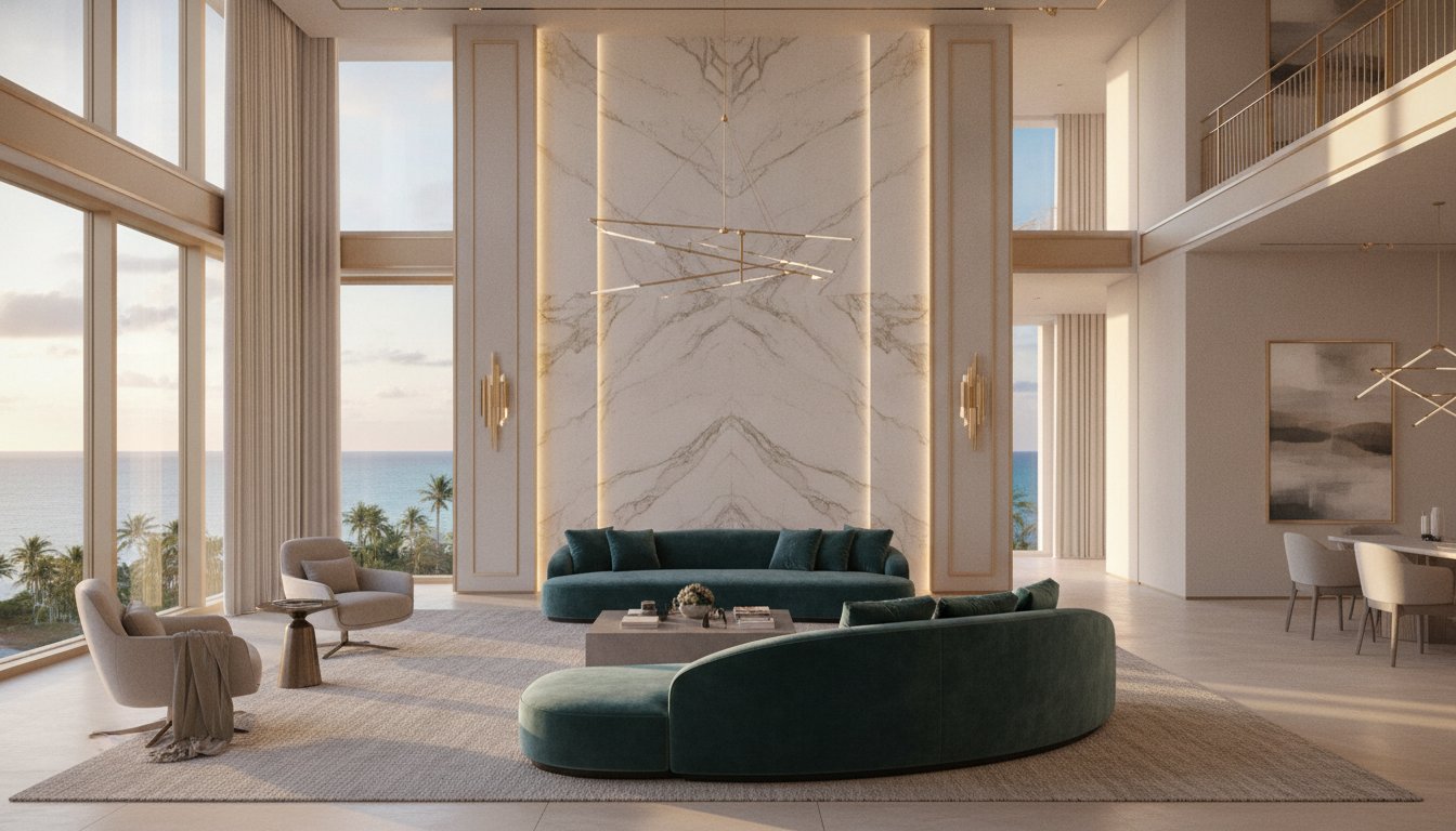
In the world of ultra-high-end design, color is never just a surface finish; it's a silent architectural force that dictates the heartbeat of a room. Many homeowners fear that a bold palette will date their investment or clash with the quiet elegance of luxury minimalism. However, mastering the psychology of color in luxury interior design allows you to transcend passing trends by anchoring your space in emotional resonance rather than visual noise. Whether you're curating a sprawling coastal estate or a private yacht, the interaction between pigment and prestige is what transforms a house into a sanctuary.
You likely understand that a home should reflect your personal legacy, yet the vast array of bespoke materials and lighting nuances can feel overwhelming. This masterclass will show you how to use intentional color theory, light, and materiality to create a residence that feels deeply aligned with your lifestyle. We'll explore the 2026 forecast for global design standards, the science of how light interacts with rare stones, and the art of selecting finishes that maintain their sophistication for decades. By the end, you'll have the confidence to select materials that don't just look expensive, but feel inherently right.
Key Takeaways
- Learn how "emotional architecture" uses color to subconsciously influence the mood and functionality of high-end residential spaces.
- Discover why the psychology of color in luxury interior design begins with the inherent hues of natural materials like Italian marble and rare woods rather than just surface pigments.
- Master the "New Neutral" palette for 2026, moving beyond simple beige toward complex, timeless earth tones that resist dating.
- Understand how to adapt color strategies for high-stakes environments, balancing the intense natural light of Miami estates with the intimate constraints of yacht interiors.
- Gain insight into a bespoke design process that leverages thirty years of expertise to ensure your chosen palette and materials evolve beautifully over time.
The Emotional Architecture of Color: Why Luxury Spaces Feel Different
Within the context of high-end residential interior design, color is far more than a decorative layer. It's a foundational pillar of what we define as Emotional Architecture. This discipline explores how specific wavelengths of light, reflected off noble materials, dictate the subconscious atmosphere of a sanctuary. The psychology of color in luxury interior design involves understanding that every hue carries a distinct frequency that can either agitate or soothe the spirit. By treating color as a structural element, we create environments that don't just look beautiful, but resonate with the inhabitant's inner state.
As we approach 2026, the industry is witnessing a definitive shift from purely aesthetic-driven choices toward wellness-focused palettes. We're no longer selecting pigments based on fleeting trends; instead, we're curating environments that support mental clarity and emotional equilibrium. The architectural volume of a home plays a decisive role in this process. A vast, double-height Great Room possesses a different "chromatic weight" than a secluded master suite. Understanding how depth and saturation interact with these volumes is essential to ensure a space feels intentional rather than hollow.
The Interplay of Light and Perception
The success of a palette depends entirely on the quality of light it inhabits. The blue-tinted, humid clarity of coastal Miami light interacts with materials differently than the crisp, high-altitude sun of Park City. To maintain color fidelity across these diverse environments, we rely on precision lighting design and specific Kelvin ratings.
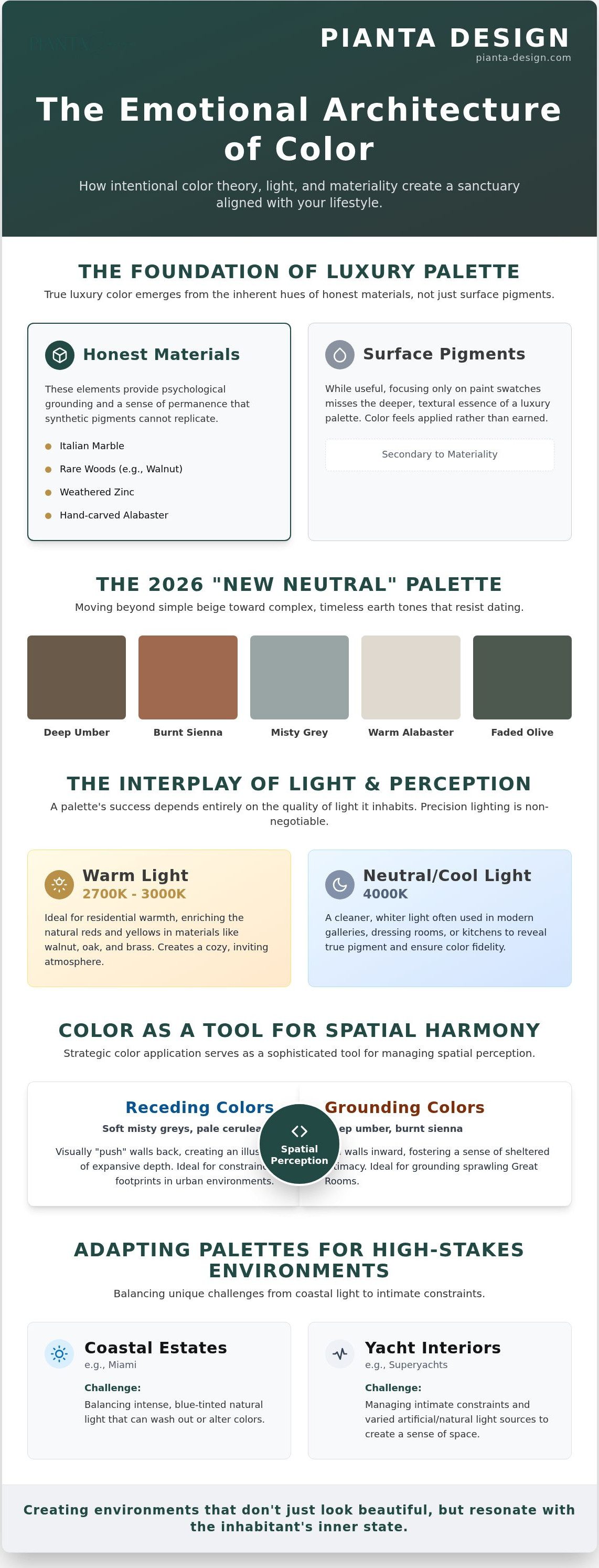
- 2700K - 3000K: Ideal for residential warmth, enriching the natural reds and yellows in walnut or oak.
- 4000K: A cleaner, whiter light often used in modern galleries or dressing rooms to reveal true pigment.
Metamerism is the phenomenon where two materials appear to be a perfect match under one light source but look significantly different under another, which is why we test every finish in situ. This technical rigor ensures the psychology of color in luxury interior design remains consistent from the morning's first light until the evening's final glow.
Color as a Tool for Spatial Harmony
Strategic color application serves as a sophisticated tool for managing spatial perception. In urban environments like San Francisco, where footprints are often constrained, we utilize receding colors. Cool tones such as soft misty greys or pale ceruleans visually "push" walls back, creating an illusion of expansive depth in smaller footprints.
In contrast, the sprawling Great Rooms of mountain estates require grounding. We use warm, earth-derived tones like deep umber or burnt sienna to pull the walls inward, fostering a sense of sheltered intimacy. By incorporating intentional color blocks, we provide the eye with visual breathing room. This deliberate use of negative space in the palette reduces cognitive load, allowing the mind to find the same order and peace that one experiences in a perfectly composed work of art.
Materiality and Hue: How Italian Craftsmanship Redefines the Palette
True luxury doesn't live on the surface of a wall; it's woven into the very marrow of the architecture. While many designers focus on paint swatches, the most profound applications of the psychology of color in luxury interior design emerge from the inherent hues of "honest" materials. These are elements that don't pretend to be anything else. The deep, chocolatey warmth of walnut, the cool grey of weathered zinc, and the creamy translucence of hand-carved alabaster provide a psychological grounding that synthetic pigments cannot replicate. This authenticity fosters a sense of trust and permanence within a home.
Our deep-rooted relationships with elite Italian manufacturers allow us to transcend standard color catalogs. By focusing on residential interior design through the lens of materiality, we source rare slabs and textiles where the color is inseparable from the texture. This integrated approach ensures that the palette feels earned rather than applied. When color is a physical property of the material, it reacts to light with a depth that creates a multi-sensory emotional response. Through custom furniture design, we further refine this journey, ensuring that a bespoke sofa or a hand-finished credenza serves as the perfect chromatic and tactile anchor for the room.
The Psychology of Natural Stone and Marble
Natural stone is the protagonist of the luxury palette. The choice between different marbles can fundamentally shift a room's emotional frequency. For instance, the soft, cool-toned veins of Carrara marble act as a calming agent, perfect for master suites where tranquility is paramount. In contrast, the high-vein drama of Calacatta, with its bold strokes of gold and charcoal, provides an energizing, authoritative presence in a foyer or kitchen.
- Honed Finishes: These create a matte, velvety surface that softens color intensity, inviting touch and suggesting a quiet, understated luxury.
- Polished Finishes: These amplify color saturation and reflect light, creating a high-energy, formal atmosphere that demands attention.
Bespoke Textiles and Italian Leather
Textiles offer the most intimate connection to the psychology of color. Custom-dyed silks and velvets allow us to dial in specific emotional resonances that are unique to your lifestyle. High-quality Italian leather is particularly vital; its natural patina develops over decades, shifting in tone and texture. This evolution creates a sense of history and "lived-in" prestige. We often collaborate directly with tanneries to source colors that aren't found in standard collections, ensuring your interior remains an entirely unique expression of your identity. If you're ready to explore how these noble materials can transform your sanctuary, our team can guide you through a bespoke material and finish selection process tailored to your vision.
The Sophisticated Neutral: Debunking the Myth of "Safe" Minimalism
Many homeowners believe that choosing a neutral palette is a compromise, a "safe" path taken to avoid future regret. This is a profound misconception. In the world of high-end design, a white or beige room isn't a blank canvas; it's a deliberate psychological statement. The psychology of color in luxury interior design treats neutrals as sophisticated, multi-dimensional tools that require precise calibration. When executed with mastery, a neutral palette doesn't disappear. It commands attention through its restraint and the quality of the light it reflects.
As we look toward 2026, the industry is moving away from clinical, stark whites toward what we call the "New Neutrals." These are complex, organic shades such as earthy mushrooms, warm greiges, and muted clay tones. These colors possess a living quality that shifts throughout the day. They embody the essence of "Quiet Luxury," where wealth and discernment are conveyed through subtle tonal shifts rather than loud, aggressive pigments. The secret to this high-end look lies in the mastery of undertones. A grey with a hidden blue undertone feels architectural and cool; a grey with a hint of green or pink feels organic and welcoming. Identifying these microscopic shifts is what separates a gallery-grade interior from a standard residential space.
Layering Tones for Depth
To prevent a neutral sanctuary from feeling flat or sterile, we employ the technique of monochromatic layering. This involves using varying shades and saturations of the same base hue across different surfaces. We differentiate these similar tones through high-contrast textures. A nubby wool bouclé sofa paired with a shimmering silk rug and smooth, heavy velvet drapery creates a sense of visual depth that paint alone cannot achieve. Psychologically, this approach significantly reduces cognitive load. By eliminating visual clutter and jarring color breaks, we promote mental clarity and allow the inhabitant's mind to find true rest.
The Strategic Pop of Color
While neutrals provide the foundation, a strategic injection of color prevents a home from feeling stagnant. We often utilize art consultation to introduce bold pigments in a way that feels curated rather than chaotic. A single, high-saturation canvas or a bespoke glass sculpture can redefine the energy of a greige-toned room without overwhelming the senses. We also view transitional spaces, such as powder rooms or private hallways, as opportunities for psychological shifts. These areas allow for more daring, intimate color choices. Throughout a multi-room project, we maintain a "red thread," a subtle, recurring color or material note that ensures a cohesive flow and a sense of narrative harmony as you move through the home.
Color in High-Stakes Environments: From Superyachts to Miami Estates
Environmental context serves as the final arbiter of chromatic success. The psychology of color in luxury interior design must adapt to the specific latitude and longitude of a project to remain effective. In a sun-drenched Miami estate, the intense, vertical light can make standard palettes feel overstimulated or uncomfortably warm. We counter this by utilizing a "Cool Coastal" strategy, employing crisp whites, sand-toned Italian stones, and pale aquas that mentally lower the perceived temperature. This creates a refreshing retreat from the tropical humidity, where the color itself provides a sense of atmospheric cooling.
In contrast, the "Warm Alpine" requirements of a Park City mountain home focus on reclaiming warmth from a landscape dominated by snow and ice. The blue-tinted light reflected off the mountainside can make a room feel clinical if not balanced correctly. We integrate grounding ochres, burnt ambers, and deep rusts that trigger a psychological response of shelter and comfort. By understanding how color influences the perception of temperature, we ensure that a home remains a sanctuary regardless of the extreme climate outside its walls.
Designing for the Sea: Yacht Interiors
Navigating the unique challenges of yacht interior design requires a masterly touch with contrast and saturation. The open ocean creates an aggressive glare that can wash out subtle palettes and cause visual fatigue. We implement high-contrast schemes to define spatial boundaries and provide visual stability in a moving environment. In the master cabins, we often move away from the bright exterior light, favoring deep, grounding tones like charcoal or midnight navy. This creates a psychological sense of security and "ballast," helping to offset the subtle, constant motion of the sea. Every material we select is tested to maintain its chromatic integrity against the corrosive effects of a high-saline environment.
The Mountain Modern Palette
High-altitude living demands a different emotional frequency. Large-scale glazing in mountain estates brings the vast, blue-toned landscape directly into the living space, which can feel overwhelming. We use fire-side tones and saturated, dark pigments to create "cocooning" environments in private areas like bedrooms and libraries. These dark tones provide a necessary psychological contrast to the expansive, bright views, allowing the occupant to feel truly sheltered. If you're ready to ground your next project in a palette that reflects both your lifestyle and your location, we invite you to explore our bespoke residential interior design services, where we blend thirty years of expertise with a global aesthetic vision.
Creating Your Signature Atmosphere: The Pianta Design Consultation
The bridge between a theoretical palette and a transformative lived experience is a meticulous, expert-led consultation. At Pianta Design, we view the psychology of color in luxury interior design as a deeply personal dialogue between the architecture and the inhabitant. With over 30 years of industry experience, we've developed a refined instinct for how pigments and materials evolve. We understand how a specific shade of Mediterranean blue or an Alpine charcoal will age over decades, ensuring your investment retains its emotional resonance long after the initial reveal. This longevity is the hallmark of true luxury.
Our process is built on the belief that a home should be an extension of your legacy. We blend the heritage of Italian craftsmanship with a sharp, modern sensibility to create spaces that feel both timely and timeless. This journey isn't about following a template; it's about discovering the specific "chromatic frequency" that aligns with your lifestyle and your personal sense of order.
The Concept and Planning Phase
Before a single material is ordered or a wall is finished, we utilize advanced 3D visualizations to test the emotional impact of our strategy. These digital renderings allow us to manipulate light and shadow in real-time, demonstrating how the psychology of color in luxury interior design will manifest in your specific volume of space. We supplement these visuals with an iterative mood board process. We present rare material samples, from hand-selected marble offcuts to custom-dyed silk swatches, allowing you to feel the weight and texture of the palette. This collaborative exploration helps us define your unique "emotional color signature," a foundation that informs every subsequent design decision.
From Vision to Reality
A brilliant concept only succeeds through flawless execution. Our role as project managers is to act as the stewards of your vision, ensuring that the integrity of the color palette is maintained through every phase of construction. We provide rigorous oversight, coordinating with artisans and contractors to ensure that material transitions are seamless and lighting installations are calibrated to the exact Kelvin ratings required. Subtle shifts in light can alter the perception of a noble material; our presence on-site ensures these nuances are respected.
Through our exclusive network of elite Italian manufacturers, we source finishes that are unavailable to the general market. This access allows us to specify materials with precise pigmentations that match our conceptual goals exactly. By managing the technical complexities of sourcing and installation, we allow you to focus on the creative evolution of your sanctuary. It's time to transform your environment into a reflection of your highest aspirations. Begin your bespoke design journey with Pianta Design and experience the profound impact of a space designed with intention and technical mastery.
Mastering the Chromatic Future of Your Sanctuary
The evolution of high-end design for 2026 moves beyond the visual to the visceral. We've explored how the psychology of color in luxury interior design is anchored in the silent language of noble materials, the precision of technical lighting, and the environmental context of your residence or vessel. True sophistication isn't found in a single trend, but in a bespoke harmony that reflects your lifestyle while maintaining an enduring, global aesthetic. Whether it's the grounding warmth of an Alpine estate or the high-contrast security of a superyacht, your palette should be a deliberate architectural choice.
With 30 years of award-winning experience and exclusive Italian manufacturing partnerships, Pianta Design specializes in translating these complex emotional frequencies into reality. We bridge the gap between artistic vision and technical precision in residential, commercial, and yacht interiors. It's time to move beyond the safe and the expected to create an environment that truly resonates with your inner state.
Schedule a Private Consultation to Refine Your Interior Palette and begin the journey toward a home that feels as extraordinary as it looks. Your vision deserves the touch of an expert who understands that every hue is a building block of your legacy.
Frequently Asked Questions
How does color psychology affect the resale value of a luxury home?
A sophisticated color strategy enhances resale value by making a property feel curated and architectural rather than just painted. In the high-end market, buyers look for emotional resonance and a sense of permanence. A well-executed palette signals that the home was designed with intention, which can reduce time on the market. Neutral, complex tones often appeal to the widest range of ultra-high-net-worth individuals while maintaining a sense of prestige.
Can certain colors actually improve my sleep quality in a primary suite?
Deep, desaturated tones like midnight navy or soft sage can significantly improve sleep quality by lowering the heart rate and promoting calm. The psychology of color in luxury interior design suggests that these receding colors signal the brain to enter a rest state. We often pair these hues with matte textures to absorb light, creating a cocoon-like environment that minimizes cognitive stimulation before you rest.
What is the best way to use bold colors in a luxury living room without it feeling cluttered?
The best way to use bold colors without creating clutter is through chromatic anchoring. Assign one dominant bold hue to a large-scale architectural element or a piece of custom furniture. Keep the surrounding surfaces in the same tonal family but at much lower saturations. This creates a focal point that feels intentional and disciplined, rather than a chaotic mix of competing pigments that exhausts the eye.
How does the 2026 color of the year fit into a timeless luxury interior?
Incorporating the 2026 color of the year into a timeless interior requires using it as a secondary accent rather than a primary foundation. We recommend integrating trend-forward hues through art consultation or interchangeable textiles like silk cushions and throws. This allows you to stay current with global design standards while your permanent architectural materials, like stone and wood, remain anchored in timeless, sophisticated neutrality.
Why do colors look different in my Miami home versus my Park City retreat?
Colors look different because of the color temperature of the natural light and the atmospheric humidity at different latitudes. Miami's light is often bright and blue-tinted, which can make warm colors feel muddy or overly yellow. Park City's high-altitude light is crisp but casts long, cool shadows. We adjust the psychology of color in luxury interior design by testing every material in the specific light of the project's location.
Is it better to choose the furniture or the wall color first in a luxury project?
It's always better to select your hero materials and custom furniture first. There are thousands of paint colors but only a limited number of rare stone slabs or exclusive Italian leathers. We build the palette around these noble materials, using the wall color as a supporting element that ties the physical textures together. This ensures the architecture and furnishings speak the same silent language of quality.
How can I use color to make a large commercial space feel more intimate?
To make a large commercial space feel more intimate, use color drenching with warm, grounding tones on both the walls and the ceiling. This visually lowers the height of the room and creates a sense of enclosure. Strategically placed darker color blocks can define smaller zones within a large floor plan. This provides the psychological comfort of a private enclave even in a sprawling, high-stakes professional environment.
What role does lighting play in the psychology of color perception?
Lighting is the medium through which color exists; without it, pigment has no emotional power. The Kelvin rating of your bulbs determines whether a material looks vibrant or dull. High-end lighting design uses layers of light to reveal the true depth of a material's hue. We use precise dimming systems to shift the color psychology of a room from an energetic morning glow to a soft, intimate evening amber.
