
Luxury Interior Design Color Trends California 2026: The New Palette of Sophistication
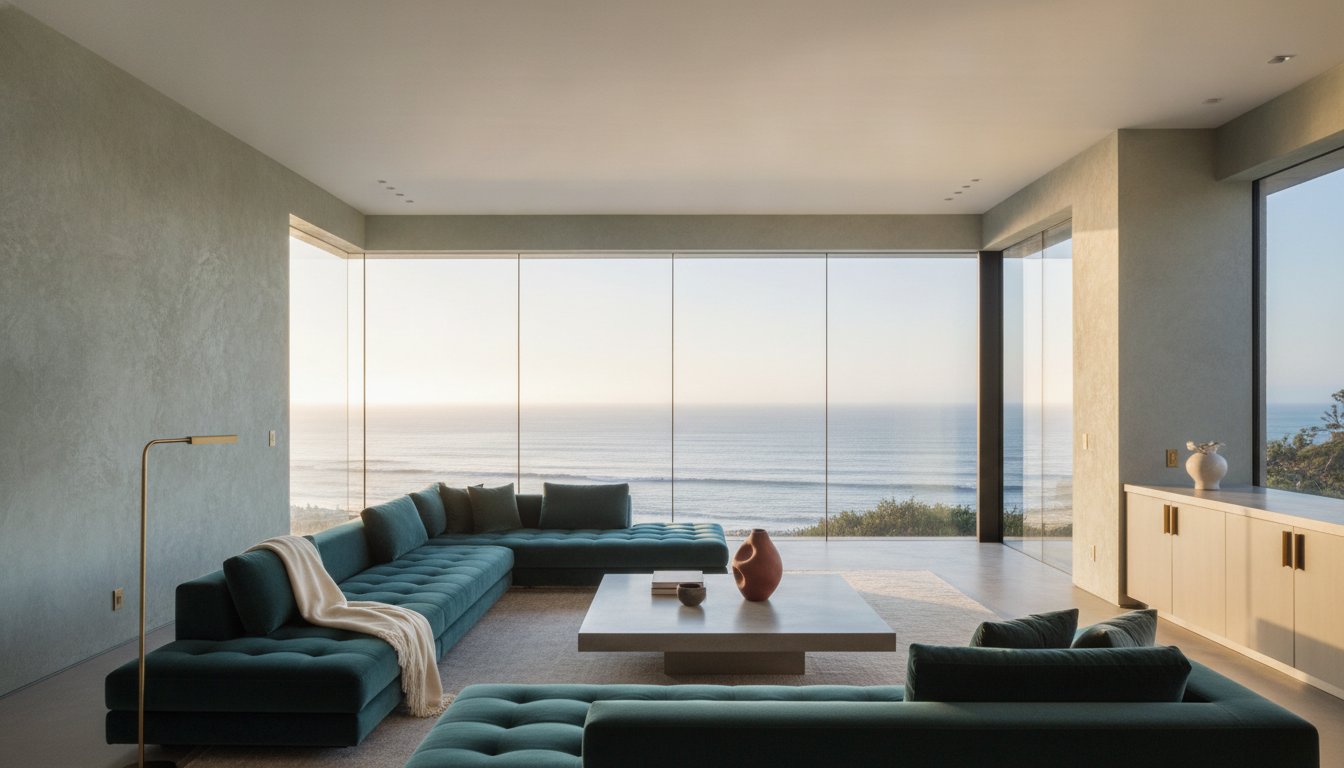
While the global design community fixates on the newfound simplicity of "Cloud Dancer" white, the most discerning estates are quietly moving toward a more profound, atmospheric organicism. This evolution defines the luxury interior design color trends california will see in 2026, replacing sterile minimalism with a palette rooted in mineral pigments and the raw beauty of Italian-sourced materials. You've likely felt the frustration of watching a trend fade before the paint is dry, or perhaps you've struggled to find sophisticated hues that don't lose their character under the intense, crystalline light of the Pacific coast.
We'll explore how to blend elite European pigments with local architectural requirements, ensuring your home feels both timeless and avant-garde. You'll gain a curated strategy for selecting colors that are inseparable from their materiality, moving beyond generic palettes into a world of bespoke finishes. This preview into the next era of sophistication provides the confidence to choose a design path that values longevity, harmony, and the quiet power of a perfectly balanced room. Discover how the union of light and texture creates a sanctuary that reflects a global perspective while remaining intimately personal.
Key Takeaways
- Understand the shift toward "Atmospheric Organicism," where warm mineral tones replace clinical minimalism to create deeper, more resonant living spaces.
- Discover how the latest luxury interior design color trends california homeowners are adopting—such as deep oxblood and muted sage—provide a timeless alternative to fleeting social media fads.
- Learn why material selection, including Venetian plaster and raw silk, is the essential first step in achieving a pigment that holds its integrity under the unique Pacific light.
- Explore the advantage of bespoke Italian manufacturing, which allows for precise pigment control and a seamless harmony between custom furniture and architectural finishes.
- Gain insights into a professional color strategy that leverages 30 years of expertise to ensure your high-end residential interiors remain sophisticated for decades.
Beyond Coastal: Defining California’s Luxury Color Landscape in 2026
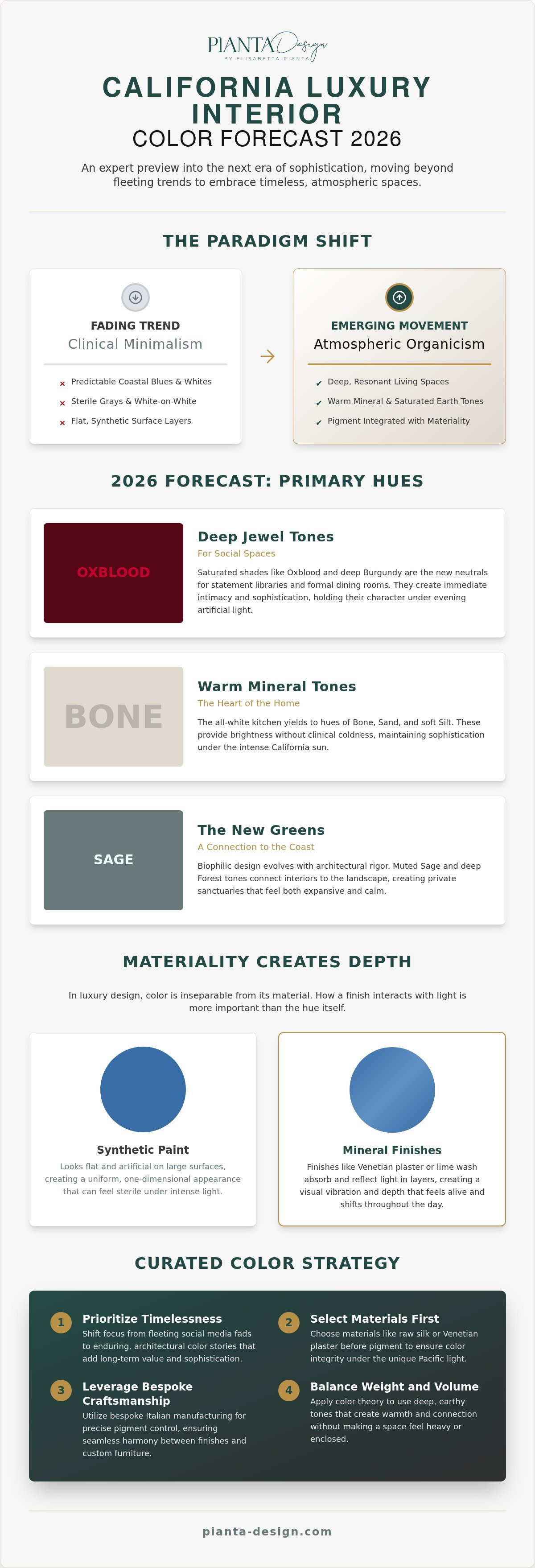
The era of clinical, white-on-white minimalism has reached its sunset. In its place, a more nuanced aesthetic known as Atmospheric Organicism is taking hold. This movement defines the luxury interior design color trends california is embracing for 2026, moving away from the predictable coastal blue and white toward a palette that feels grown, not just applied. It's an architectural approach where color isn't a surface layer but an integral part of the home's structure. We're seeing a decisive transition from traditional "transitional" styles to curated, architectural color stories that favor permanence over fleeting fashion.
This shift is most visible in the heart of the home. The ubiquitous all-white kitchen is yielding to "Warm Mineral" tones. These bone, sand, and soft silt hues provide the brightness homeowners crave without the clinical coldness of previous years. Choosing these shades requires a sophisticated understanding of how California’s natural light functions. The intense, crystalline Pacific sun tends to desaturate high-chroma colors, making them appear garish. By opting for pigments with complex, muted undertones, designers ensure that spaces maintain their sophistication even at high noon.
The Shift from Cool Grays to Saturated Earth Tones
The sterile grays of the last decade are being replaced by "Terra d’Ombra" and other clay-based pigments. These tones provide a sense of grounded luxury that cool neutrals simply cannot match. Psychologically, these earthy palettes foster a connection to the landscape, turning a high-end residence into a true sanctuary. Using these hues effectively requires a deep understanding of the principles of color theory, as the goal is to create warmth without the space feeling heavy. It's about finding the balance between a color's weight and the room's volume.
Mineral Pigments and the Return of Depth
Modern luxury isn't about the hue itself; it's about the depth. Synthetic paints often look flat and artificial when applied to large architectural surfaces. Mineral-based finishes, such as Venetian plaster or lime wash, interact with light in a completely different way. They absorb and reflect it in layers, creating a visual vibration that feels alive.
Consider a recent project in a San Francisco living room where we utilized a deep ochre mineral pigment. While a standard synthetic paint would have felt overwhelming and heavy, the mineral-driven depth allowed the walls to shift beautifully from morning to dusk. The color didn't just sit on the wall; it became a part of the atmosphere. This highlights why luxury interior design color trends california for 2026 are inextricably linked to the quality of the materials themselves.
The 2026 Forecast: Primary Hues Redefining High-End Interiors
The 2026 forecast reveals a striking departure from the safe, predictable neutrals of the past decade. While mass-market guides highlight "Cloud Dancer" white, the true luxury interior design color trends california is seeing revolve around a return to pigment-heavy, evocative hues. These colors don't merely fill a room; they define its character and emotional weight. We're seeing a movement where the home becomes a series of curated experiences, each room offering a distinct atmosphere through the lens of architectural permanence rather than fleeting fashion.
Deep Jewel Tones for Social Spaces
Oxblood and deep burgundy are emerging as the new neutrals for statement libraries and formal dining rooms. These saturated tones create an immediate sense of intimacy, especially in large-scale properties where volume can often feel cavernous. Designing for evening ambiance requires a richness that ensures the room doesn't lose its soul under artificial light. We often pair these deep reds with dark walnut cabinetry and honed Italian marble to ground the space. This approach aligns with the moody, sophisticated aesthetic seen in Benjamin Moore's 2026 Color of the Year, Silhouette AF-655, which brings a charcoal-infused espresso depth to high-end interiors.
The New Greens: A Connection to the California Coast
The biophilic evolution continues but with a more architectural rigor. We've moved past the playful "mint" shades of previous years toward "architectural sage" and deep olive. These greens act as a bridge for indoor-outdoor transitions, particularly effective in homes with expansive glazing. Olive tones provide a stunning backdrop for bespoke furniture design, allowing the natural grain of woods like oak or teak to pop. Integrating these greens with natural stone flooring creates a seamless flow that feels both modern and timeless.
Metal accents are also evolving. Polished brass is giving way to burnished gold and bronze; finishes that are designed to age and develop a patina over time. These "living" finishes reflect a desire for authenticity and the passage of time. Finally, we're introducing "Invisible Blue," an ultra-pale cerulean. It's used to frame Bay Area views, as the pigment is specifically mixed to match the horizon line, effectively making the window frames disappear and pulling the Pacific into the living space. This level of detail is what separates a standard renovation from a truly curated residential masterpiece.
Italian Craftsmanship Meets West Coast Light: The Pianta Signature
Achieving the perfect palette in a coastal estate isn't merely about selecting a swatch; it's about the chemistry of the finish. The luxury interior design color trends california demands for 2026 require a level of chromatic integrity that standard domestic paints often lack. At Pianta Design, we bridge the distance between the historic ateliers of Milan and the vibrant, high-contrast light of San Francisco. This global-local dialogue ensures that the colors you choose maintain their depth and soul, regardless of the sun's intensity. It's a sophisticated approach that treats color as an architectural element rather than a decorative afterthought.
Bespoke Pigment Control in Custom Furniture
Off-the-shelf furniture often fails to meet the standards of high-end residential interior design because the colors are designed for generic environments. True luxury lies in the ability to control every nuance of a pigment. Through our direct relationships with Italian manufacturers, we develop bespoke lacquers that are color-matched to the specific mineral veins of your chosen California stone. This level of precision creates a rhythmic harmony between architectural elements and furnishings that feels intentional and permanent.
Technical resilience is just as vital as aesthetics. California's sun-drenched coastal rooms are beautiful, but they're also harsh on delicate finishes. We utilize advanced Italian finishing techniques that provide superior UV stability. Whether it's a custom-dyed leather sofa or a raw silk wall covering, the pigments are engineered to resist fading. This ensures that the "living" quality of your home's palette remains vibrant for decades. Choosing custom-dyed materials is the ultimate flex for 2026, offering a level of exclusivity that mass-produced items can't replicate.
The Global-Local Dialogue
Our process involves integrating refined European color theory into the expansive architectural footprints typical of West Coast estates. While an "Old World" palette might favor deep, moody shadows, we adapt these sophisticated pigments to work with the "New World" light that defines San Francisco and Miami. This isn't a simple translation; it's a meticulous recalibration of saturation and value. With 30 years of experience, we've mastered the art of ensuring a pigment looks as intended at both dawn and dusk.
Pianta Design sources exclusive materials from Italian partners that aren't available through standard channels. This includes everything from rare wood veneers to custom-woven textiles. To further refine the space, our art consultation services bridge any remaining color gaps. We select pieces that don't just match the room, but elevate the entire color story. It's a holistic approach where every detail, from the furniture's grain to the canvas on the wall, contributes to a unified, sophisticated atmosphere. This ensures your home remains a testament to the luxury interior design color trends california is currently defining.
Materiality and Pigment: How to Apply 2026 Trends to Your Space
In high-end design, the wall color is often the final decision, not the first. To truly master the luxury interior design color trends california is moving toward in 2026, one must start with material and finish selection. Pigment is a secondary characteristic of the surface it inhabits; it doesn't exist in a vacuum. A flat, synthetic paint cannot replicate the way light dances across a hand-troweled surface or the soft, organic shimmer of raw silk. By choosing your materials first, you ensure that the color isn't just a layer of paint, but a fundamental part of the room's soul.
The Return of Plaster and Tactile Finishes
Flat paint is no longer sufficient for luxury interiors that aim for permanence. We're seeing a massive return to Venetian plaster and lime wash because these aren't just finishes; they're "living" walls. The high mineral content in these materials allows for an interplay of light and shadow that shifts throughout the day. In the cool morning fog of a San Francisco coastal home, the walls might appear ethereal and soft. As the golden hour hits, that same surface glows with an internal warmth that feels almost three-dimensional. This tactile depth is the hallmark of the 2026 aesthetic, providing a sensory experience that digital trends can't capture.
Color Coordination with Natural Stone
Rare marbles like Calacatta or the porous, architectural elegance of Travertine provide the natural anchors for a modern palette. The goal for 2026 is to match the subtle, often overlooked veining of these stones to your wall pigments. We're seeing a sophisticated trend of "Color-Drenching," where the stone, the custom lacquer on the cabinetry, and the wall finish all share the same tonal DNA. This requires precise space planning to ensure that transitions between different materials feel fluid. When the color of a velvet armchair perfectly echoes a streak of mineral in the fireplace surround, the room achieves a rare level of visual harmony.
Lighting serves as the invisible pigment in this equation. The choice between 2700K and 3000K LEDs can completely alter how your palette is perceived. A deep burgundy that looks regal and inviting under 2700K warm light might feel overly aggressive or "muddy" under cooler 3000K illumination. We carefully calibrate every light source to ensure your chosen hues maintain their sophistication under every condition. If you're ready to define a palette that transcends temporary fads, our team specializes in the meticulous Material and Finish Selection required for world-class residential interiors.
Crafting Your Bespoke Color Story with Pianta Design
Understanding the luxury interior design color trends california is currently embracing is only the first step in a much larger, more intricate journey. Transforming these global influences into a cohesive, personal sanctuary requires both an artistic eye and technical precision. At Pianta Design, we don't simply apply trends; we curate them to reflect your individual narrative. With 30 years of industry experience, we understand that the success of a palette lies in its execution. Our process ensures that the sophisticated hues we've discussed, from mineral-driven earths to architectural greens, are perfectly balanced within your specific environment.
Our Comprehensive Design Consultation
The journey starts with an initial conceptualization phase where we translate your vision into a tactile mood board. This is where we finalize the material and finish selections that drive your color story. To provide absolute clarity, we utilize advanced 3D visualizations. This allows you to "test-drive" the 2026 trends within the digital twin of your home. You can see exactly how the Pacific light interacts with a deep burgundy dining room or how a sage bedroom feels at sunset. This technological bridge eliminates uncertainty, providing the confidence needed for bold, sophisticated choices.
Managing color accuracy throughout a project requires meticulous construction oversight. We don't leave the final result to chance. Our team works directly with artisans and contractors to ensure that every hand-troweled plaster finish and custom lacquer matches our original vision. This level of full-service project management is vital for maintaining color consistency across large-scale residential projects. Whether we're coordinating with Italian manufacturers for custom furniture or overseeing the application of mineral pigments, our presence on-site ensures the integrity of the design remains uncompromised.
The Final Reveal: Art and Accessories
The final layer of a room's color story is often the most personal. Our art consultation services help you select pieces that provide the necessary contrast or harmony to your new palette. We leverage our deep relationships with Italian partners to source one-of-a-kind accessories that pop against the sophisticated neutrals of 2026. These final touches aren't merely decorative; they're the punctuation marks in your home's aesthetic sentence. They bring a sense of life and "lived-in" luxury that mass-market solutions simply cannot provide.
We invite you to begin your transformation with a personalized consultation. Whether you're located in San Francisco, Miami, or Park City, our offices are ready to guide you through the creation of a world-class interior. Contact Pianta Design today to discuss your next residential project and discover how we can weave the luxury interior design color trends california will celebrate in 2026 into a timeless, bespoke home.
Defining the Next Era of California Sophistication
The shift toward "Atmospheric Organicism" marks a turning point where homes become sensory sanctuaries rather than mere showcases. By prioritizing mineral depth and the structural integrity of pigments, you ensure your residence remains immune to the transience of social media fads. Mastering the luxury interior design color trends california will see in 2026 requires more than a simple eye for beauty; it demands a technical mastery of light, materiality, and global sourcing that only comes with time and dedicated craft.
With over 30 years of luxury design excellence, Pianta Design specializes in bridging the gap between visionary aesthetics and flawless execution. Our exclusive Italian manufacturer partnerships allow us to provide bespoke solutions for yachts and high-end residences that don't exist in the retail market. Every shade and texture we select is a deliberate step toward a more harmonious lifestyle. Elevate your home with a bespoke Pianta Design consultation and begin the process of creating an environment that resonates with your unique perspective. Your home is your most intimate canvas; let's paint it with the pigments of permanence.
Frequently Asked Questions
What is the most popular luxury color for California homes in 2026?
While the official Pantone choice for 2026 is "Cloud Dancer" white, the most resonant luxury interior design color trends california estates are adopting focus on warm mineral tones. We are seeing a significant move toward bone, silt, and sand hues that offer a sophisticated alternative to clinical whites. These pigments provide a deeper connection to the natural landscape, offering a sense of permanence and warmth that feels more intentional than standard neutrals.
How do I choose a color palette that won’t go out of style?
Timelessness is achieved by selecting colors rooted in natural materials and mineral pigments rather than fleeting synthetic trends. Opt for hues like ochre, clay, and terra d'ombra, which have remained staples in architectural history for centuries. By coordinating these pigments with high-quality materials like natural stone and fine woods, the palette feels like an organic part of the home's structure. This approach ensures your design evolves gracefully across decades.
Does California coastal light affect how paint colors look inside?
The intense, crystalline light along the California coast significantly desaturates high-chroma colors, often making them appear flatter or more garish than intended. To compensate, we recommend using colors with complex, muted undertones that can withstand the bright Pacific sun without losing their character. Professional lighting design also plays a crucial role in maintaining color integrity during the evening, ensuring your curated palette remains sophisticated under both natural and artificial illumination.
What is atmospheric organicism in interior design?
Atmospheric organicism is a design philosophy that moves away from flat, sterile surfaces toward environments defined by depth, texture, and mineral-driven pigments. It prioritizes materials like Venetian plaster, lime wash, and raw silk to create a visual vibration on the walls. This aesthetic fosters a sanctuary-like atmosphere where the environment feels grown rather than manufactured, blending the boundaries between the architectural interior and the natural world outside the window.
Should I use the same color throughout my entire luxury home?
Instead of a single uniform color, we recommend a cohesive color story that allows for atmospheric shifts between different living zones. While a shared tonal DNA should run through the property to ensure visual flow, individual spaces can utilize different saturations to define their specific purpose. For instance, a dining room might feature deep jewel tones for evening intimacy, while the main living area remains light to maximize coastal views.
How does custom furniture design help with color coordination?
Custom furniture design allows for a level of precision in color coordination that off-the-shelf pieces simply cannot match. We collaborate with Italian manufacturers to create bespoke lacquers and custom-dyed textiles that perfectly echo the mineral veins in your home's stone or the specific pigment of your wall finishes. This level of control ensures a rhythmic harmony throughout the space, making every element feel like a deliberate part of a unified architectural vision.
What are the best materials for achieving deep, textured color?
To achieve the depth required by the latest luxury interior design color trends california, you should prioritize materials with high mineral content. Venetian plaster and lime wash are exceptional for creating living walls that catch the light in layers. Additionally, raw silk and custom-woven wools provide a tactile richness that synthetic fabrics lack. These materials allow pigments to penetrate deeply, resulting in a visual complexity that flat paint cannot replicate.
Why is Italian craftsmanship important for interior design color trends?
Italian craftsmanship is vital because it offers a legacy of pigment mastery and technical innovation that ensures color longevity. Our direct relationships with Italian artisans provide access to exclusive finishes and UV-stable dyes specifically engineered for high-end residential environments. This expertise ensures that sophisticated colors maintain their integrity even in sun-drenched coastal rooms. By blending these traditional techniques with modern architecture, we create interiors that are both culturally resonant and technically superior.
