
Luxury Interior Design Color Palettes: A Masterclass for Homes in San Francisco, Miami, and Park City
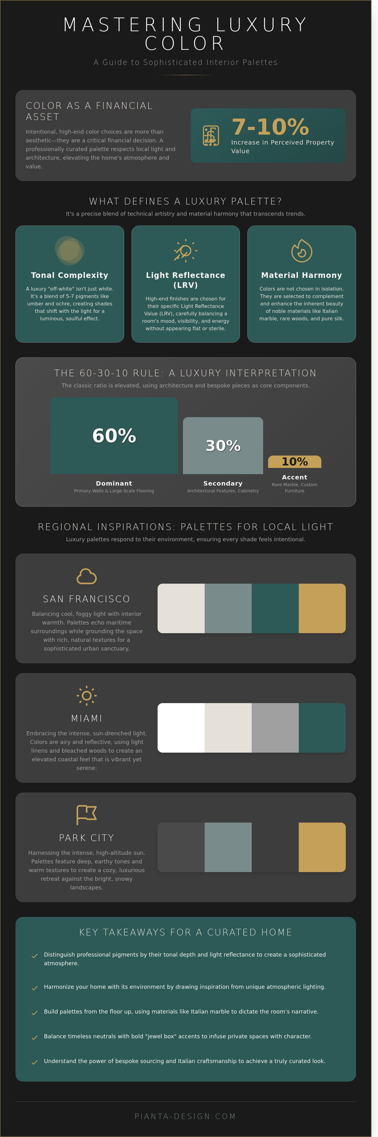
What if the "timeless" ivory that radiates warmth in a San Francisco Victorian looks like a cold, clinical mistake under the intense, high-altitude sun of Park City? You've likely felt the quiet anxiety that comes with choosing a shade, knowing that a single tonal error can make a premium renovation feel dated within months. It's a valid concern, as the most successful luxury interior design color palettes are those that respect the unique dialogue between local light and architectural heritage. Data from 2023 industry reports suggests that intentional, high-end color choices can increase a property's perceived value by 7% to 10%, making your choice of pigment a critical financial decision.
This masterclass will guide you through curating sophisticated schemes that blend the effortless elegance of Italian design with the distinct spirits of America's most exclusive zip codes. We'll show you how to master the interplay between light and texture so your home reflects a level of personal sophistication that transcends seasonal fads. From the misty coastal tones of the Bay Area to the sun-drenched vibrancy of Miami, you're about to discover how to build a cohesive visual narrative that feels both global and intimately yours.
Key Takeaways
- Learn how tonal depth and light reflectance distinguish professional-grade pigments from standard retail colors to create a truly sophisticated atmosphere.
- Discover how to harmonize your home with its environment by drawing inspiration from the unique atmospheric lighting of San Francisco, Miami, and Park City.
- Master the technique of building luxury interior design color palettes from the floor up, using the natural veining of Italian marble to dictate your room’s narrative.
- Find the perfect balance between timeless neutrals and bold "jewel box" accents to infuse your private spaces with character and intimacy.
- Understand the transformative power of bespoke sourcing and Italian craftsmanship in achieving a curated look that off-the-shelf items cannot replicate.
What Defines Luxury Interior Design Color Palettes?
Luxury color is an exercise in restraint and technical precision. It moves beyond the simple selection of a hue. High-end design relies on how a surface captures and reflects the specific light of a location, whether it's the cool, foggy morning of San Francisco or the intense, tropical sun of Miami. These luxury interior design color palettes don't rely on standard retail paint. Instead, they utilize custom-mixed pigments that respond to the environment. Achieving a truly bespoke look requires an understanding of how luxury interior design color palettes interact with architectural volume and natural illumination.
The psychological impact of these choices defines the atmosphere of "quiet luxury." It's a feeling of curated calm that doesn't need to shout for attention. The elements of interior design, specifically light and texture, anchor the room's color story. By grounding the selection in color theory fundamentals, designers ensure that the palette feels timeless. This approach avoids the sterile, flat appearance often found in lower-end minimalist projects that lack professional-grade pigments.
- Tonal Complexity: Professional palettes use multiple colorants to create shades that shift with the sun.
- Light Reflectance: High-end finishes consider the LRV (Light Reflectance Value) to balance mood and visibility.
- Material Harmony: Colors are chosen to complement noble materials like silk, stone, and rare woods.
The Concept of Tonal Depth and Sophistication
In high-end design, an "off-white" is never just white. It often contains five to seven different pigments, including layers of umber, ochre, or even hints of violet, to provide richness. This complexity prevents the space from feeling cold or commercial. Tonal depth in the context of high-end Italian finishes refers to the multi-layered perception of color where light penetrates several translucent strata of pigment to create a luminous, three-dimensional effect. This technique ensures that even a monochromatic room possesses visual movement and soul.
The 60-30-10 Rule in a Luxury Context
The traditional 60-30-10 ratio evolves when applied to bespoke residences. The 60% dominant color typically covers the primary wall surfaces and large-scale flooring. The 30% secondary color often highlights architectural features like hand-carved crown molding, coffered ceilings, or custom cabinetry. This elevates the structure itself to a design element. Finally, the 10% accent isn't just a throw pillow. In a professional scheme, a piece of custom furniture or a rare marble slab serves as the high-impact accent. This creates a balanced, intentional environment that feels cohesive and deeply personal.
Regional Inspirations: Palettes for San Francisco, Miami, and Park City
Light defines the soul of a home. The crisp, ethereal "blue hour" of San Francisco demands a different approach than the saturated, tropical "golden hour" of Miami. Understanding how geography alters light is fundamental to mastering Color Theory in Interior Design. We curate luxury interior design color palettes that respond to these environmental nuances, ensuring every shade feels intentional rather than accidental.San Francisco: The Urban Sophisticate
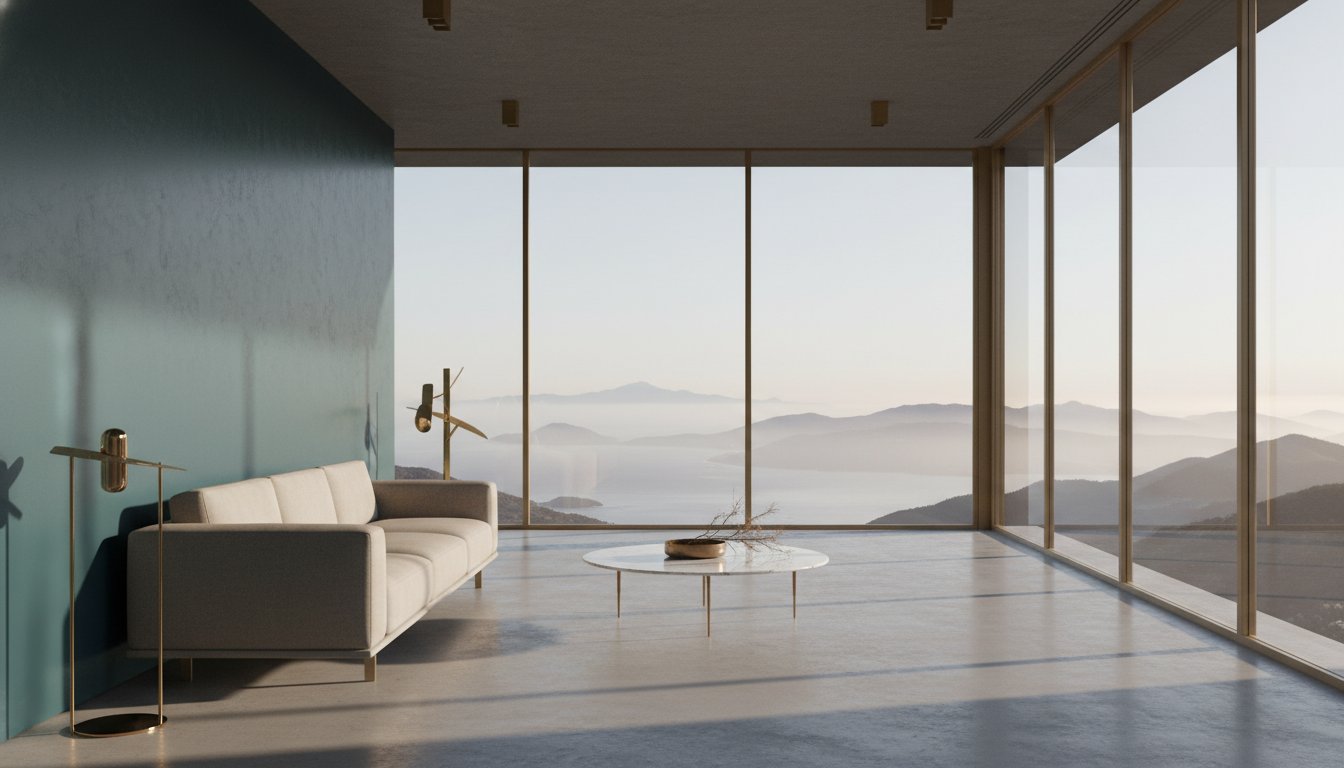
Designing for the Bay Area requires a delicate balance between the cool, foggy exterior light and the need for interior warmth. In neighborhoods like Pacific Heights or the Duboce Triangle, where 1890s Victorian architecture often meets 21st-century minimalism, the color story must bridge two worlds. We utilize "fog" neutrals and deep navys to echo the maritime surroundings. These cool tones are grounded by authentic Italian walnut and rich textures. This combination creates a transitional feel that respects the city's heritage while embracing modern luxury. The goal is a space that feels like a sanctuary during the city's frequent overcast afternoons.Miami: Elevated Coastal Living
Miami's environment is defined by intensity. With over 240 days of sunshine per year, the light is piercing and vibrant. To combat this, we rely on high-reflectance whites with a Light Reflectance Value (LRV) of 85 or higher to bounce the sun's energy without creating glare. We reflect the Atlantic through muted corals and sophisticated aquas, avoiding the kitsch of traditional "beachy" decor. Many of our clients are now integrating commercial interior design concepts into their waterfront condos to achieve a sleek, hospitality-inspired aesthetic. This approach uses sand-tones and high-gloss finishes to create a seamless flow from the terrace to the living room.Park City: The Modern Mountain Retreat
At 7,000 feet of elevation, the light in Park City is sharp and honest. The design philosophy here shifts toward "Earth-anchored" tones that mirror the Wasatch Range. We use a palette of slate, moss green, and oxidized copper to bring the outdoors in. Large-scale homes with expansive mountain views require a careful hand; heavy stone features like granite or basalt must be balanced with soft, neutral textile palettes.- Slate and Charcoal: These provide a sturdy foundation for high-ceilinged great rooms.
- Forest Greens: These connect the interior to the surrounding pines and aspens.
- Warm Timber: Reclaimed wood or honey-toned oak adds the necessary warmth to combat snowy winters.
Materiality and Texture: Why Luxury Color Extends Beyond Paint
True sophistication in a residence isn't achieved through a bucket of paint alone. At Pianta Design, we approach every project with a "floor-up" philosophy. This means the palette begins with the foundational materials that ground a space. We treat the ceiling as the "fifth wall," often dressing it in hand-applied Venetian plaster or architectural wood coffers that interact with the light. When you select luxury interior design color palettes, you're actually selecting a symphony of light-reflective values across different surfaces.
The interplay of textiles is where the palette gains its soul. A deep navy doesn't look the same on a silk wallcovering as it does on a mohair velvet sofa. Silk reflects light, often creating a shimmering, ethereal quality that brightens a room; velvet absorbs light, offering a moody, tactile depth that feels grounded and secure. We layer these textures to create "color shadows," a technique that adds dimension without needing to introduce too many contrasting hues. Metallic finishes like unlacquered brass, blackened bronze, or polished chrome serve as the room's jewelry. These finishes provide a final, sharp layer of "color" that punctuates the softer elements of the design.
The Italian Influence on Material Color
Our design process involves sourcing materials directly from Italian manufacturers to capture pigments that possess a unique, artisanal vibration. These craftsmen understand that the finish is just as vital as the hue. We often utilize the tension between matte and gloss surfaces to create visual interest. For instance, a matte charcoal cabinetry set against a high-gloss backsplash creates a sophisticated monochrome look that feels anything but flat. In these high-end environments, texture is the silent partner of color. It's the tactile experience that confirms the visual promise of luxury. When we reference the Best Color Palettes for Luxury Interior Design, we see that the most enduring spaces rely on these subtle, material-driven shifts rather than trendy paint colors.
Natural Stone as the Palette Foundation
Natural stone is the ultimate anchor for a master suite or a grand kitchen. We source exotic slabs where the "vein color" dictates the entire room’s direction. A Calacatta marble with warm, honey-colored veining requires a different wall tone than a Carrara marble with its signature cool, bluish-grey streaks. We meticulously match wall paints to these subtle undertones to ensure the stone feels integrated rather than isolated.
- Calacatta Gold: Leads to palettes of cream, champagne, and warm whites.
- Graphite Marbles: Pair beautifully with silver-leaf accents and cool-toned charcoals.
- Travertine: Sets a stage for earthy, organic neutrals and matte textures.
You can see these principles in action throughout the Pianta Design portfolio, where we use custom-cut stone to bridge the gap between architecture and decor. By letting the natural materials lead, the luxury interior design color palettes we create feel timeless, organic, and deeply personal to the homeowner's lifestyle.
The Art of Layering: Balancing Bold Accents with Timeless Neutrals
Luxury isn't about playing it safe. While a monochromatic gray palette might have defined the previous decade, today’s most sophisticated luxury interior design color palettes prioritize depth and tactile richness over sterile uniformity. Avoiding the "all-gray" trap requires a mastery of layering where neutrals serve as a quiet stage for personal expression. We see this shift in 2024 and 2025 design cycles, where designers move away from flat surfaces toward plaster finishes, silk-threaded wallpapers, and stone with heavy veining to introduce character without sacrificing elegance.
One of the most effective ways to introduce drama is through the "Jewel Box" room. Smaller, enclosed spaces like libraries, wine cellars, or powder rooms offer the perfect canvas for deep, saturated hues. A library wrapped in floor-to-ceiling lacquered navy or a powder room in oxblood marble creates an immersive experience that feels both intimate and indulgent. These rooms act as a sensory departure from the lighter, airy communal spaces of a residence.
Art consultation plays a pivotal role in this layering process. Rather than selecting art to match a rug, we derive the room’s accent colors from the client’s collection. A single stroke of burnt sienna in a contemporary canvas can dictate the velvet choice for a lounge chair or the pigment of a custom-woven throw. Looking toward 2026, seasonal layering involves swapping these smaller elements. We recommend transitioning from light linens in summer to heavier, amber-toned mohair and brushed brass accessories in winter to keep the palette dynamic yet grounded.
Creating a Cohesive Whole-Home Flow
Maintaining a "Red Thread" is essential for architectural harmony. This design philosophy involves carrying a single hue, material, or specific undertone throughout the entire residence to ensure a seamless transition. To avoid a visual jolt when moving from a bright Miami sunroom to a cozy media lounge, we use consistent flooring or trim colors. The strategic use of interior lighting design further unifies these spaces. By adjusting color temperatures (measured in Kelvins) across different rooms, we ensure that a warm neutral in the kitchen doesn't turn sickly green under the wrong bulb, maintaining the integrity of the luxury interior design color palettes you've chosen.
The Power of High-Contrast Accents
Contrast is the secret to architectural impact. While charcoal is soft, "true" midnight black provides a crispness that defines space. Using black steel window frames or ebonized oak cabinetry creates a frame for the view outside, whether it’s the San Francisco skyline or the Park City mountains. For clients seeking a nod to iconic fashion houses, we integrate subtle, brand-inspired accents like Hermès Orange or Tiffany Blue through custom piping on upholstery or the interior of a bar cabinet. This ensures the art remains the focal point while the architecture provides the necessary weight and balance.
Ready to transform your space with a bespoke color story? Elevate your home's aesthetic with our expert design team today.
Bespoke Color Sourcing: The Pianta Design Philosophy
Pianta Design brings a 30 year heritage of Italian excellence to the American luxury market. We don't just follow trends; we often create the very dyes that define them. Our philosophy centers on the belief that a home's chromatic identity should be as unique as a fingerprint. While standard retailers offer a finite selection of swatches, our studio leverages deep-rooted connections with European artisans to develop luxury interior design color palettes that exist nowhere else. This level of customization ensures that your living environment isn't a replica of a showroom, but a bespoke sanctuary tailored to your specific aesthetic sensibilities.
The Advantage of Custom Procurement
Off-the-shelf furniture often forces homeowners to compromise on their vision. You might find the perfect sofa silhouette, but the fabric options are limited to a handful of predictable neutrals. We bypass these limitations by collaborating directly with family-owned workshops in regions like Brianza and Tuscany. These relationships allow us to specify exclusive textile colors and unique wood finishes that aren't available in traditional catalogs.
- Exclusive Textiles: We source silks, linens, and velvets in custom-dyed shades that perfectly match your home's natural light.
- Authenticity: Your palette remains "one-of-a-kind," protecting your home from the "Pinterest-copy" effect often seen in high-end developments.
- Global Logistics: Our team manages the complex logistics of international shipping, ensuring materials arrive from Italy to your project site in San Francisco, Miami, or Park City without delay.
By controlling the production process, we ensure that every hue is intentional. Whether it's a specific shade of Mediterranean azure for a Miami waterfront villa or a deep, earthy ochre for a Park City mountain retreat, the color is crafted specifically for the space it will inhabit.
Designing Your Legacy Home
There's a fundamental difference between a "decorated" home and a truly "designed" interior. A decorated home follows fashion; it's a collection of beautiful objects that might lose their luster as seasons change. In contrast, professional residential interior design is an investment in your long-term lifestyle. It considers how color affects your mood, how light interacts with textures, and how the flow of the home supports your daily rituals.
We view every project as the creation of a legacy. This involves a meticulous approach to luxury interior design color palettes where we balance timeless elegance with personal character. The result is a space that feels lived-in yet curated, sophisticated yet deeply personal. It's about finding the "dolce vita" in the details of your own home.
Your journey toward a more refined living environment begins with a single conversation. We invite you to define your signature palette and transform your residence into a masterpiece of color and light. Book a professional consultation with Pianta Design today to explore the possibilities of custom Italian craftsmanship in your home.
Refining Your Vision Through Sophisticated Color
Designing a home that resonates with its environment requires more than just a keen eye for aesthetics. It demands an understanding of how light interacts with local landscapes, from the mist of San Francisco to the vibrant shores of Miami and the rugged peaks of Park City. Selecting the right luxury interior design color palettes is a journey through texture and materiality, where the depth of a hand-applied finish or the grain of a rare stone matters as much as the hue itself. It's about finding that perfect equilibrium between bold expression and enduring elegance.
With over 30 years of high-end design experience, our team bridges the gap between global inspiration and local expertise through our dedicated offices in California, Florida, and Utah. We leverage exclusive partnerships with Italian manufacturers to source bespoke materials that ensure your space remains timeless and authentic. This holistic approach transforms a mere residence into a curated sanctuary that reflects your unique narrative. We believe that your environment directly influences your quality of life, and every detail should be treated with the reverence it deserves. Your home is waiting to tell its story through a lens of unparalleled craftsmanship and artistry.
Begin your journey toward a bespoke luxury interior; contact Pianta Design today.
Frequently Asked Questions
What are the most popular luxury color palettes for 2026?
The 2026 luxury landscape favors "Biophilic Sophistication," featuring deep ochre, muted sage, and oxidized copper. These palettes move away from cold grays, embracing 75% warmer base tones to create sanctuary-like environments. You'll see a rise in "midnight plum" as a sophisticated alternative to black in high-end residential projects. This shift reflects a global desire for interiors that feel both grounded and exceptionally rare.
How do I choose a color palette that won’t go out of style?
To ensure your palette remains timeless, follow the 60-30-10 rule using 60% architectural neutrals like stone or plaster. Use 30% for secondary colors in semi-permanent fixtures and save the final 10% for seasonal accents. Industry data from 2024 shows that homes using a "warm-neutral" base retain their aesthetic appeal for 12 years longer than those following hyper-trendy cycles. It's about building a foundation that transcends seasons.
Does a luxury color palette have to be neutral?
Luxury interior design color palettes don't need to be neutral; they require intentionality and depth. Deep navy, emerald, and burgundy feel incredibly premium when applied in matte finishes or silk wallcoverings. The key is maintaining a 70% balance of sophisticated textures so the bold hues feel grounded. Rich colors often convey more character and "old-world" prestige than a standard beige gallery wall when executed with professional precision.
How does lighting affect my interior color choices in Miami vs. Park City?
Miami's intense coastal sun, often exceeding 10,000 foot-candles of brightness, requires cooler undertones like crisp whites or soft blues to balance the heat. Park City interiors face the opposite challenge, as snow reflects 80% of UV light, creating a blue tint indoors. To counter this, we use "warm-weighted" palettes with amber and camel tones to maintain a cozy atmosphere. It's a science of balancing the external environment with internal comfort.
Can I use bold colors in a luxury home without it looking "cheap"?
Bold colors look expensive when you choose paints with a 40% higher pigment load, such as those found in European designer collections. You shouldn't use high-gloss finishes on large surfaces, as they reflect light in a way that can look synthetic. Instead, opt for a "dead flat" matte or a subtle eggshell. These finishes absorb light, giving colors like charcoal or deep teal a velvety, high-end presence that feels substantial and curated.
What is the "quiet luxury" color trend and how do I achieve it?
Quiet luxury is achieved through a 90% neutral base layered with rich, tactile textures like cashmere and honed stone. It's an aesthetic that prioritizes quality over logos, utilizing a "tone-on-tone" approach with sand, oatmeal, and mushroom hues. This creates a serene, expensive feel that relies on the interplay of light and shadow. It's about how the color feels to the touch as much as how it appears to the eye.
How do I coordinate color across different materials like wood, stone, and fabric?
Coordination relies on matching the "hidden" undertones of your materials, ensuring that 100% of your selections share either a cool or warm base. If you're using Calacatta marble with gold veining, pair it with white oak or brass to maintain a warm harmony. Mixing a cool-toned Carrara marble with warm cherry wood often creates a visual clash. This mismatch disrupts the professional balance and flow required in a high-end space.
Should the color palette be the same in every room of a luxury house?
You shouldn't use the exact same colors in every room, but 100% of the home should share a cohesive "visual DNA." We recommend a "bridge color" that appears in at least 15% of every space to ensure a smooth transition. This creates a sense of flow through the luxury interior design color palettes, making the architecture feel like one unified masterpiece. It allows each room to have its own personality while remaining part of a whole.