
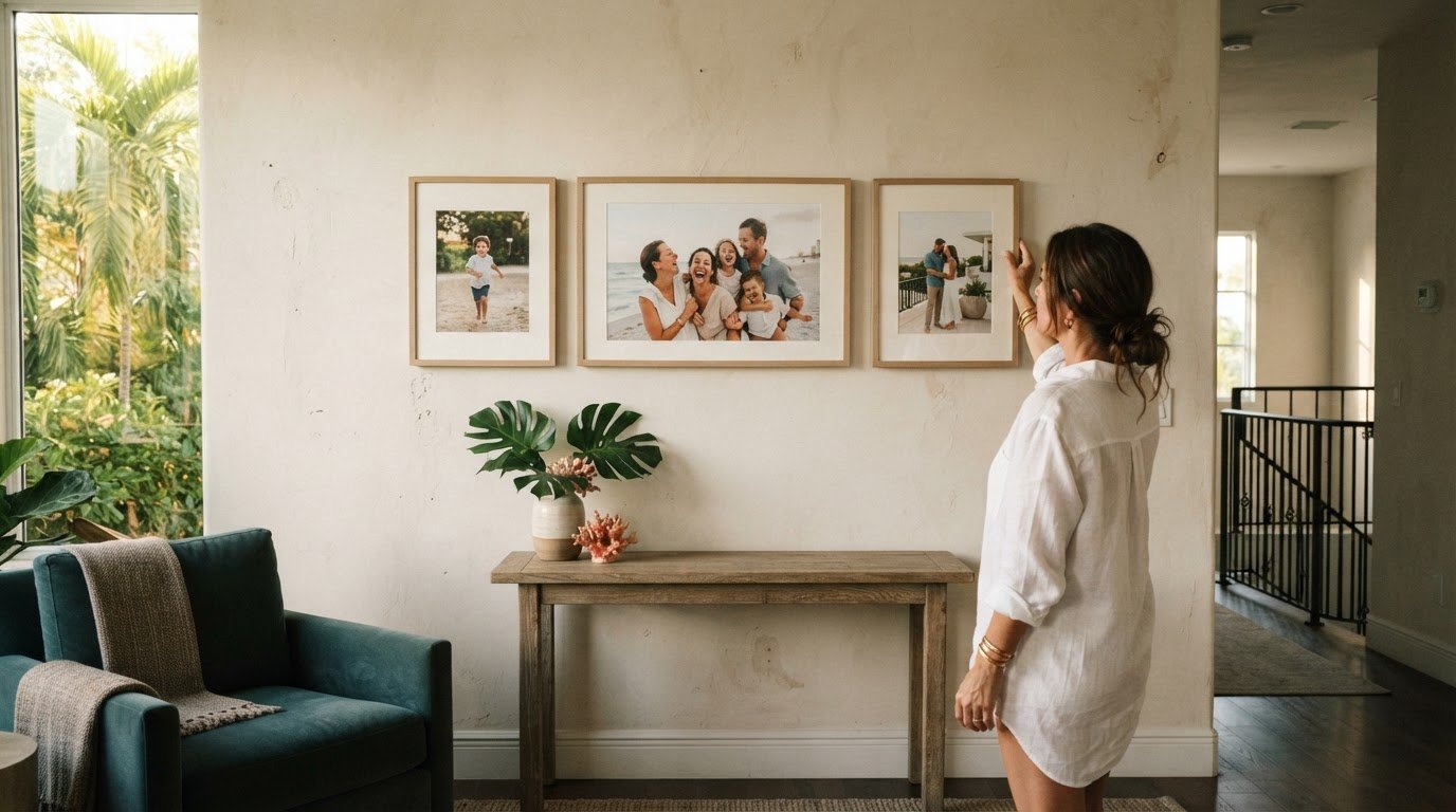
More photographs don’t always make a more meaningful gallery wall. In 2025, minimalist arrangements of two or three pieces were popular, and that restraint offers a thoughtful starting point for creating a gallery wall for personal photos. A carefully edited selection, connected by a shared tone, subject, or frame, can feel cohesive without losing the warmth and individuality that make the images meaningful. The aim isn’t to display every photograph, but to give each chosen moment room to belong.
It’s natural to want a gallery wall to tell a story, not just gather favorite images. Thoughtful editing helps that story read clearly across the room. Whether you prefer a compact grouping or a more expansive composition, proportion, spacing, and a consistent visual thread make the display feel intentional. This guide explains how to select photographs, plan a balanced arrangement before hanging, and use current trends without making the result feel impersonal. You’ll also find practical ways to leave room for future additions and refresh the wall as your collection evolves.
Key Takeaways
- Choose framed prints so you can refresh photographs over time while keeping the overall display in place.
- Arrange frames on the floor first, starting with the largest pieces, then record the layout and spacing before hanging.
- Consider grid, symmetrical, or asymmetrical arrangements to suit the wall and the character of the room.
- Edit photographs with care, using a consistent visual thread to make varied memories feel considered together.
Using framed prints that can be replaced over time
Choose frames that let you update photographs without rebuilding the arrangement. Keep the selection curated, while leaving room for new prints and meaningful moments.
-
Choose Frames for Photo Orientation
Match each frame’s orientation to its photograph: use portrait frames for vertical images and landscape frames for horizontal ones. Check the frame opening against the print before assembling it, so the image sits neatly without cropping an important face or detail. A considered mix of sizes and styles adds movement while keeping the display personal. Framed prints are easy to update later: replace the image and store the previous print inside its frame.
-
Arrange Frames and Adjust Spacing
Lay the frames out before hanging, then adjust their positions until the composition feels balanced. Leave 2-3 inches between frames as a practical spacing guide; check the gaps across the full arrangement so one crowded area doesn’t disrupt the rhythm. Gather a tape measure, pencil, level, and suitable hanging hardware before marking positions. To help keep frames straight, attach brackets at both top corners of each frame, then align the frames as you hang them.
- Use renter-friendly hanging methods. To reduce wall holes, choose removable picture-hanging strips suited to the frame’s weight and wall surface, and follow the product’s application and removal instructions. Adhesive methods do not work on every finish. This approach avoids nails, and careful placement makes it easier to adjust the display before committing to a permanent arrangement.
- Check lighting and glare. View the framed prints from the room’s main seating and walking positions, both in daylight and after dark. Reflections can obscure photographs, especially behind glass, so adjust the placement to avoid direct glare from windows and lamps. If you add accent lighting, aim it to illuminate the prints without reflecting back toward the viewer.
Arranging artwork on the floor before hanging
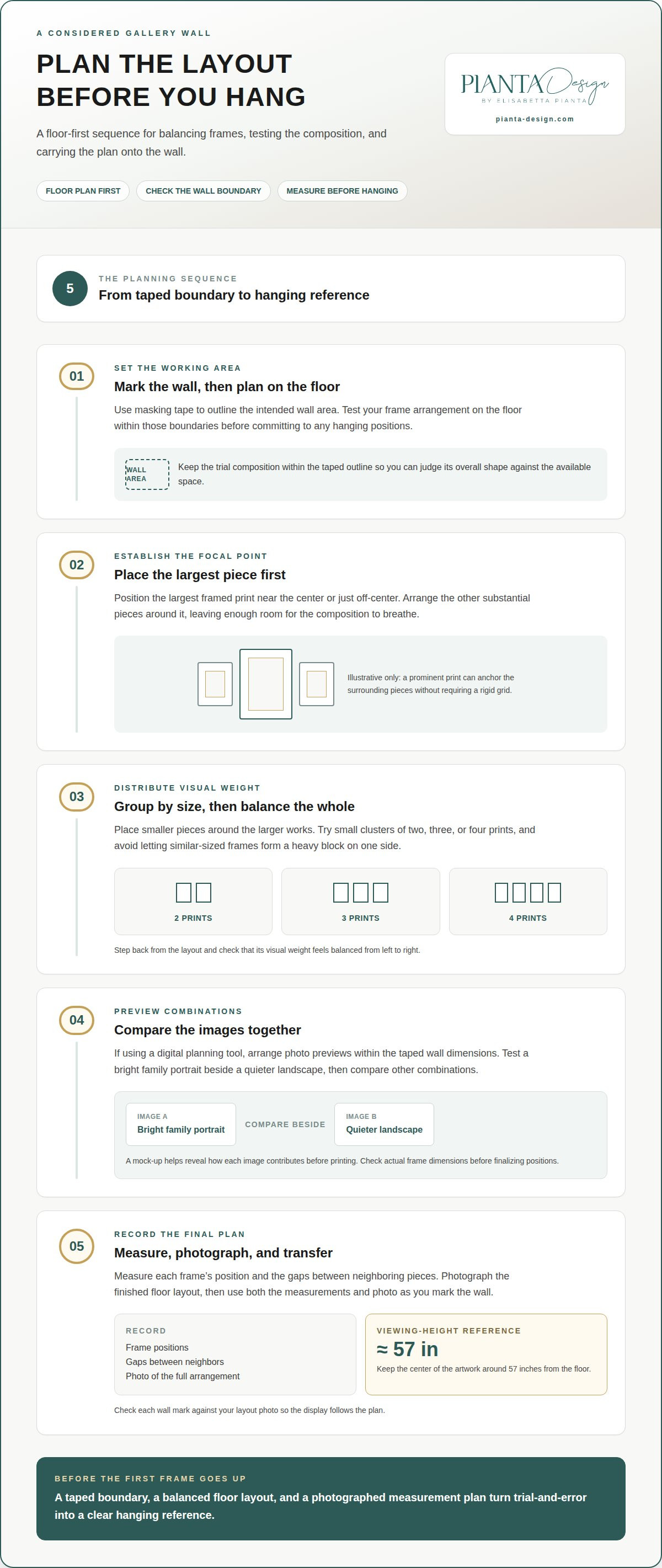
Before hanging, mark the wall area with masking tape and test the composition on the floor. Photograph the final layout to use as a reference while you work.
-
Place Large Pieces First
Place the largest framed print near the center or just off-center to establish a focal point. Arrange the other substantial pieces around it, then check that the overall shape fits within the taped boundaries. A large photograph can anchor the display without forcing every smaller frame into a rigid grid. Leave enough room around the central piece for the composition to breathe.
-
Arrange Pieces by Size
Group frames by size, then distribute smaller pieces around the largest works. Try small clusters of two, three, or four prints to create rhythm within the larger arrangement. Avoid letting similar sizes form an unintended heavy block on one side. Step back from the floor layout and check that the visual weight feels balanced from left to right.
- Upload and arrange personal photos. If you’re using a digital planning tool, upload the photographs and arrange their previews within the taped wall dimensions. Test a bright family portrait beside a quieter landscape, then compare other combinations. A digital mock-up helps you see how each image contributes before printing, but check the actual frame dimensions before finalizing positions.
- Measure the layout before hanging. Measure each frame’s position and the gaps between neighboring pieces, then photograph the arrangement for reference. Keep the center of the artwork around 57 inches from the floor for a balanced viewing height. Transfer the measurements to the wall carefully, checking each mark against your layout photo so the finished display follows the plan exactly.
- Plan the overall expense. The total depends on the number and sizes of prints, frame materials, and hanging hardware. Design fees depend on the project and are provided after a quote request.
What are 2025’s biggest gallery wall trends?
In 2025, minimalist gallery wall arrangements of two or three pieces were popular. Above furniture, position the grouping so it feels connected to the piece below without crowding it; consider the furniture’s height and the room’s sightlines.
- Choose a layout that suits the room. A symmetrical arrangement gives a hallway or living room a composed, formal character. A grid works well when frames share dimensions and spacing. For a more relaxed effect, choose an asymmetrical layout and balance a larger piece with smaller works. Let the wall space and photographs guide the format instead of forcing every collection into the same structure.
- Use a digital layout suggestion as a starting point. Enter the available wall dimensions and, where the tool allows, your frame sizes. Review automated suggestions for proportion and balance, then adjust the arrangement to suit your photographs and furniture. Treat the output as a draft, not a final hanging plan, and check that each suggested frame fits your actual wall space.
- Plan the composition before hanging. Mark the intended boundary with removable tape, then view the layout from the doorway and main seating area. In a hallway, check how the arrangement reads as you walk past; above a sofa, assess its relationship to the furniture. A canvas can feel different from a close-set group of frames, so consider the scale and visual weight of each piece together.
- Test the balance, not just the pattern. For a symmetrical layout, keep corresponding pieces aligned; for an asymmetrical one, distribute visual weight across the wall. Try a two- or three-piece grouping before expanding it, since that scale reflects a popular 2025 minimalist direction. Step back after each adjustment and give the photographs thought as a unified arrangement, not isolated decorations.
Hang the display close enough to the furniture to feel visually connected, while leaving enough space to avoid crowding. Consider the furniture’s height and the room’s sightlines when choosing its position.
Selecting and editing photos to create a cohesive look
Start with a small edit: choose images that share a subject, tone, or visual quality. A favorite family portrait and a quiet landscape can feel connected through similar warmth and framing.
- Choose the story first. Gather photographs around a clear theme, such as family gatherings, travel, or everyday rituals. Select images that capture different moments within that story, rather than several pictures with identical compositions. For example, a vacation grouping might pair a landmark, a candid meal, and a close-up detail.
- Compare images side by side. Place the selected pictures together and notice their light, color, and contrast. A bright beach scene may dominate beside softer indoor portraits, while several muted images can create a calm sequence. Keep photographs that add useful contrast, but remove those that compete without adding meaning.
- Edit with consistency. Crop photographs to strengthen their focal points, keeping faces and important details comfortably within the picture. Adjust brightness and color lightly so images retain their natural character. A consistent edit can unite photographs taken on different occasions without making every print look identical.
- Use a template to test the selection. Place paper shapes matching each frame’s dimensions on the floor or a digital canvas. Swap image positions and notice how darker photographs affect the overall balance. A staircase can suit a rising sequence, while a single wall may work well for images arranged around a central favorite.
- Review the collection from a distance. Step back from the template and look for repeated colors, subjects, or framing details. Check whether each image has a distinct role, such as setting the mood or drawing attention to a shared memory. Keep the collection curated, with enough variety to make the arrangement feel personal.
To connect photographs with the surrounding room, explore considered material and finish selection as part of a cohesive interior scheme.
Pianta Design
Pianta Design helps bring a gallery wall into harmony with the room around it. When personal photographs are part of a broader residential or commercial interior, thoughtful space planning can guide the wall’s scale, placement, and relationship to furniture, finishes, and lighting. The result is a considered composition that feels connected to the space rather than added as an afterthought.
Turn to Pianta Design when you’re shaping a room as a whole, planning a renovation, or integrating a photo display into a distinctive interior. Residential Interior Design, Commercial Interior Design, Custom Furniture Design, and Yacht Interior Design can each support a cohesive environment where artwork and everyday life sit comfortably together.
For guidance on incorporating a personal photo display into your space, contact Pianta Design.
Let the display grow with your home
A gallery wall can change with the room over time, rather than remain a fixed composition. As new memories become meaningful, the display can evolve with them, reflecting the life unfolding around it. Creating a gallery wall for personal photos is not simply about filling a surface; it gives personal images a lasting place in your home’s character.
Consider how the finished wall should feel in daily life. It might offer familiarity in a hallway, bring warmth to a living area, or give a quiet corner a more personal point of view. Let the arrangement evolve at a pace that feels right. A thoughtful interior leaves room for change without losing its sense of harmony.
If you’re planning a wider interior project alongside your display, contact Pianta Design to discuss how the space can support your vision. Your photographs can become a meaningful part of a home that feels distinctly yours.
Frequently Asked Questions
What’s the difference between a gallery wall and a photo gallery wall?
A gallery wall can combine photographs with paintings, prints, mirrors, or dimensional art, while a photo gallery wall focuses on photographs. For example, a family-room display might mix a travel photo with an illustration and a small textile piece. A photo-only arrangement could instead follow one family, place, or period of life. Choose based on whether you want varied artwork or a story told through images.
How do I plan a gallery wall layout for personal photos?
When creating a gallery wall for personal photos, begin with the story you want to tell, such as family milestones, travel memories, or portraits across generations. Select images that support that idea, then consider the wall’s shape and nearby furniture. A narrow wall beside a doorway may suit a vertical arrangement, while a broad wall can accommodate a wider composition. Keep the viewing position in mind.
How do I measure and space frames evenly on a gallery wall?
Measure each frame’s outer dimensions, not just the photo opening, since the frame edge determines the visible gap. A spacing guide of 2-3 inches helps keep neighboring pieces distinct. Use the same measuring point each time, such as the frame edges, and check horizontal and vertical gaps. Consistent spacing matters most in a grid; a looser arrangement can vary while still feeling deliberate.
What frame sizes and photo print sizes work best for a gallery wall?
Choose sizes according to the wall’s available area and each image’s visual importance. A 24 by 36-inch print can serve as a focal piece, while a 24 by 20-inch print offers a different proportion nearby. Smaller photographs can fill supporting positions. Check that each image’s crop suits its frame opening, and consider a mat when you want more visual breathing room around a photograph.
How can I choose photos and arrange them for a cohesive gallery wall?
Choose images with a connecting quality, such as shared subject matter, similar light, or a consistent color mood. Then look for contrast that adds character, like a candid portrait beside a quieter landscape. Review the photographs together in the room’s lighting, because colors can look different from a phone screen. Remove images that distract from the central story, even if each feels meaningful on its own.
What are common gallery wall layouts, such as grid, salon, or linear?
A grid arranges frames in aligned rows and columns for a structured effect. A salon layout groups pieces of varied sizes in a more flexible composition, while a linear layout follows a horizontal or vertical line. For creating a gallery wall for personal photos, choose a grid for a formal setting, a salon arrangement for an eclectic collection, or a linear display along a hallway. Let the wall’s proportions guide your choice.
